Included Health’s Concierge Referral
Summary
In partnership with Included Health’s navigation team, I added educational language to the beginning of the Concierge Referral intake process. The new language clarifies for users what the Concierge Referral service is and how it works.
Context
Concierge Referral is one of Included Health’s most used services. As part of the service, Included Health take information from members about their health and their preferences; then, the company matches the member with a doctor in their area who aligns with their needs.
Problem
Although concierge referrals are highly used, members aren’t always satisfied with the service. One of the biggest detractors is that members' expectations about the service don’t always align with the experience. For instance, members expect to get matched with a doctor in seconds, whereas the actual referral process takes about 2 business days. This is due to the fact that Included Health’s concierge team takes the time to review each member’s needs and preference, then carefully matches them to a doctor in their area that aligns with what the member is looking for. The other disconnect is that members expect to receive more than one doctor recommendation, but the service only matches members to one doctor. This is not clear in the current experience.
Objective
The goal was to set clear expectations for members about what the service is and how it works by updating the entry points within the app with educational language.
Stakeholders
Product Manager, Product Designer, Engineers, Researchers
My Approach
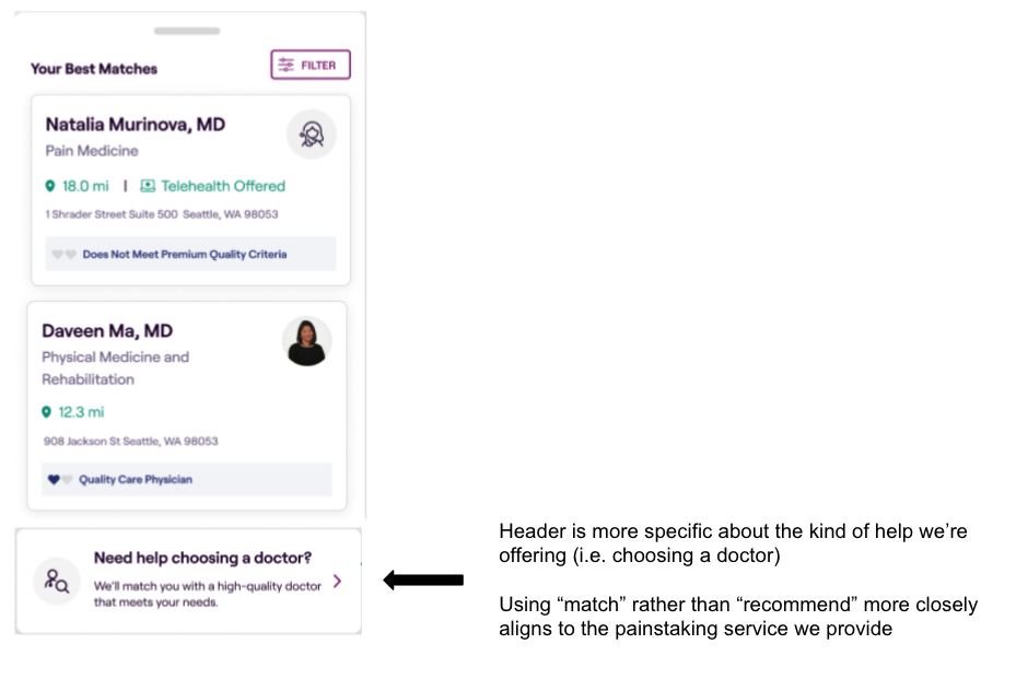
Before the updates, users could enter the Concierge Referral intake flow by opening the Included Health app > selecting Find Care > generating a list of provider matches > scrolling to the bottom of the results page and selecting Get Help Now (see image below)
As part of the updates, I abbreviated the entry point from a bulky paragraph to a more concise CTA.
Selecting the new entry point then takes members to a new screen I created with the Product Designer. This screen serves as an interstitial page where members can learn more about the service before actually initiating a referral.
Results
We accomplished two things with these updates:
Increased member satisfaction: By educating members about what Concierge Referrals are and setting clearer expectations about the timeline, we increased member satisfaction with the service.
Decreased “low-intent” Concierge Referrals: Before the updates, we were noticing that many members were initiating referrals but not actually completing the intake process. We assumed this was due to the fact that, since the entry points were not clear about what the service was, many members were initiating referrals simply to learn more about the service. Once they entered the intake process and realized what they were getting into, many member were dropping out mid-experience. After updating the copy, the number of referrals decreased, but the number of conversions increased. We assume this is due in large part to the copy now being clearer about what the service is and about what members can expect.


