UI copy for Little Italy San Diego App
Problem
Guru, the company I worked for at the time, was building a mobile app for San Diego’s Little Italy neighborhood, complete with audio tours, augmented reality, videos, games and more. However, the challenge was organizing and presenting all this content in a seamless mobile experience.
Objective
Create an Information Architecture for the Little Italy San Diego App and write UI copy.
Timeline
Aug 2015 - Nov 2015
Stakeholders
Project manager, UX writers, UX designers, legal
My Role: UX Writer
Collaborated with Product Designer and other UX writers in designing the app’s IA. We held various brainstorming sessions and organized sorting exercises for a small pool of users
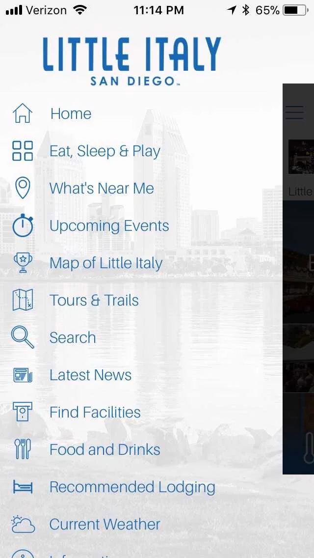
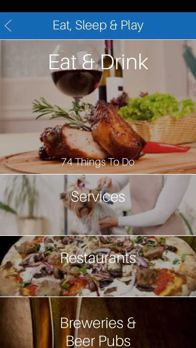
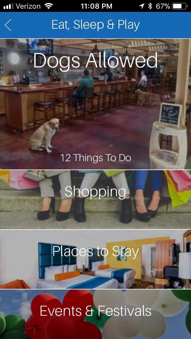
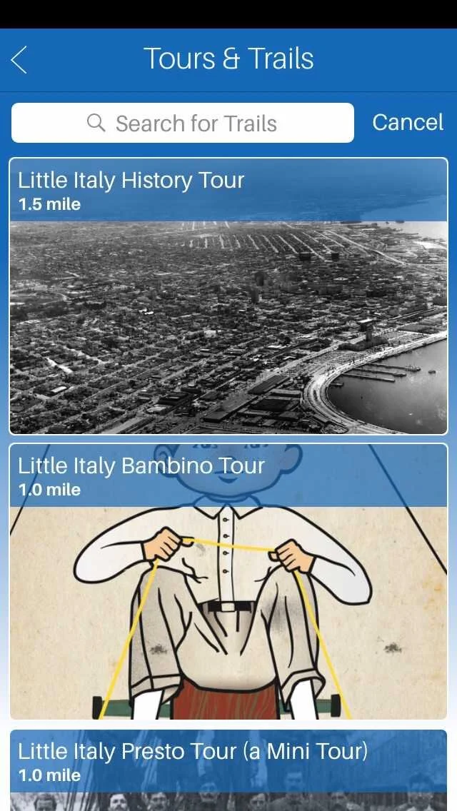
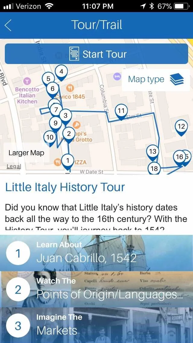
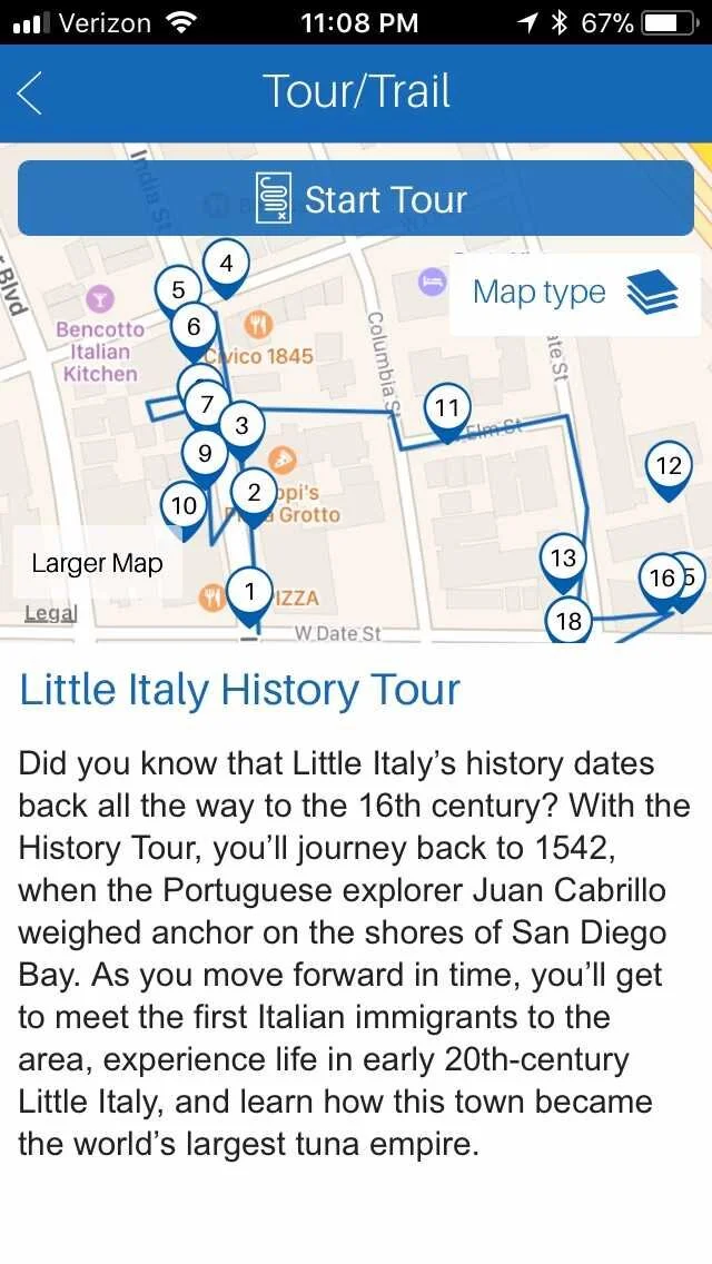
Complemented visuals with engaging copy that made navigation an intuitive experience
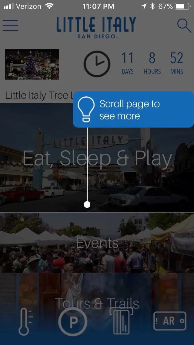
Wrote instructions for short tutorials meant to instruct users on how to take advantage of all the app’s features
Paraphrased snippets from audio tours to complement audio storytelling with text
Results
App has a 5 star rating on the App Store
Medium named the app as one of 9 Best Apps for San Diego
